

Awhile back I had the incredible opportunity to work with Jay Carroll on a few projects he had cooking when he moved down to Los Angeles. This was one of those projects. A short little musical piece by David Garza out at the Bunkhouse in Marfa Texas. Beautiful imagery and beautiful music smashed together. Hope you enjoy it.
Coffee For The Creative "Stop Drinking Bad Coffee"
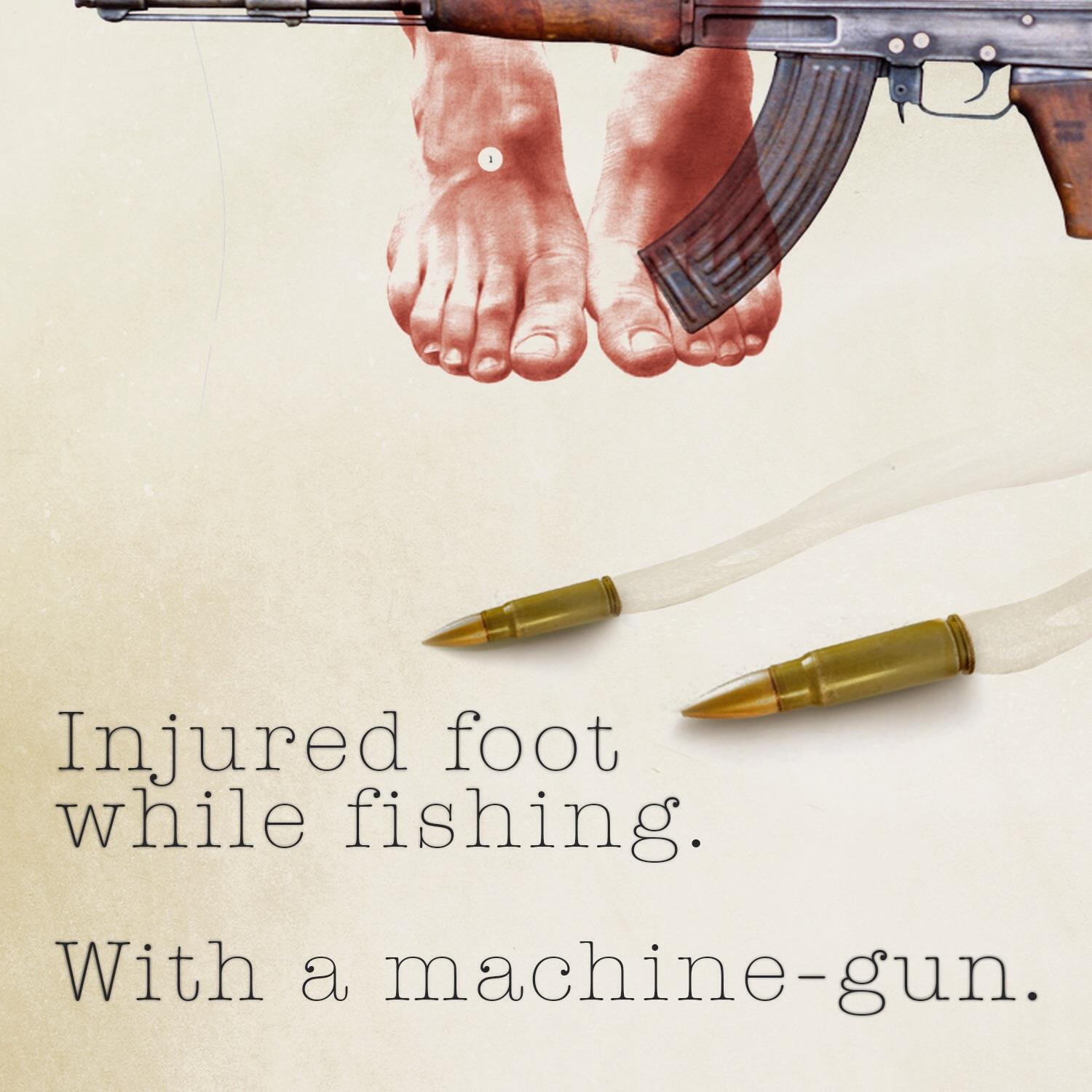
Tried to find my creative juice this week after a bad injury has put me off for the past few weeks. I'm starting to feel better, and I guess that my longing to create is finally returning. So... Stop Drinking Bad Coffee. :)
Letters On Paper
I created this piece called "Letters On Paper" over a year ago when we still lived in a 520 square foot cottage in Santa Monica California. We were staring down some big changes to our family, the way we were living, and our how we'd relate to our work. I haven't felt super comfortable sharing this work, but I figure if I'm uncomfortable with it, it's probably worth sharing. I wrote this piece in a series of segments and split the film up into pieces based on those segments. I hope you can take the time to watch them all in the order I had intended them to be consumed. I hope you enjoy it.
Part 1:
Part 2:
Part 3:
Part 4:
Part 5:
Conclusion:
The Ernest Hemingway Foundation
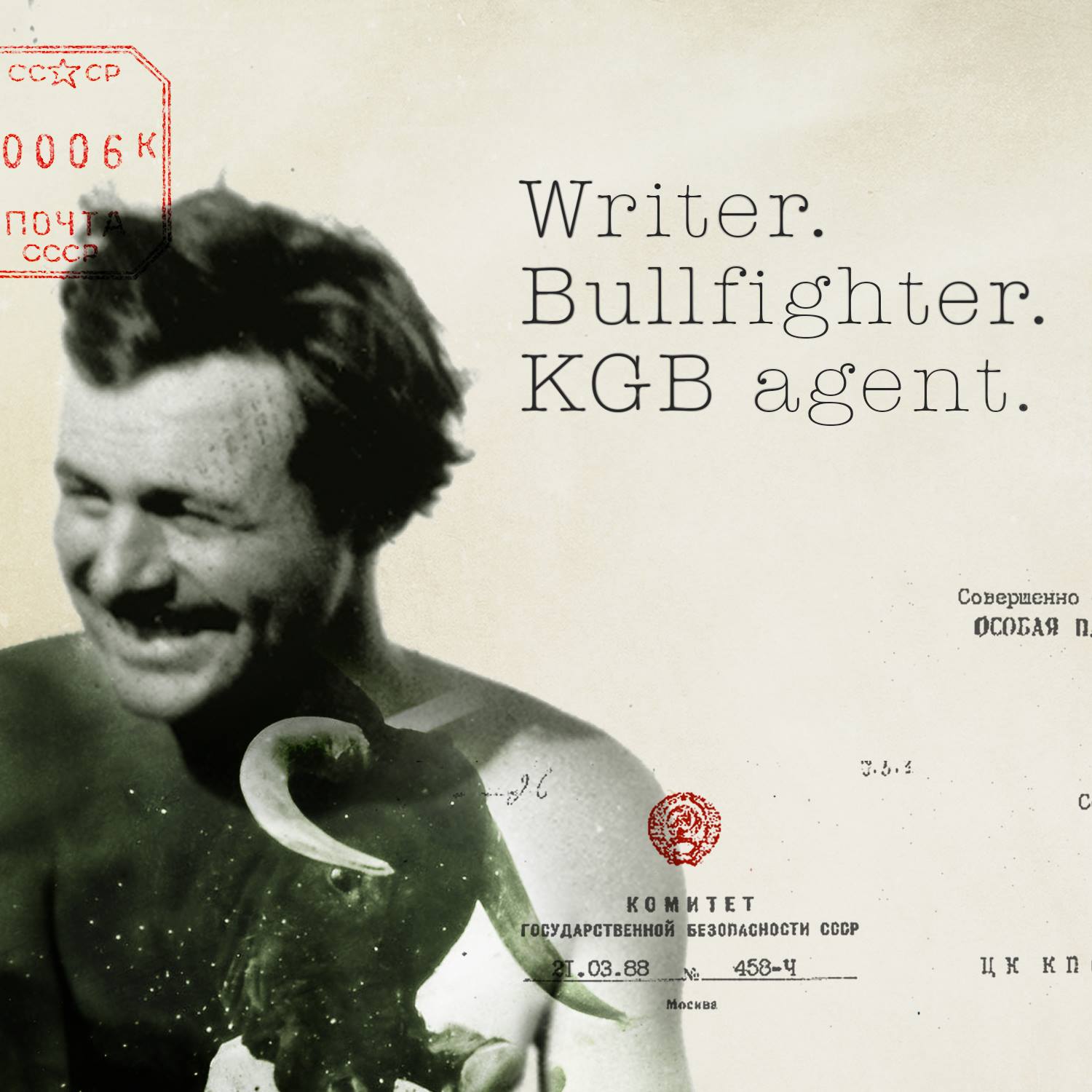
Was doing some browsing during a render today and came across this great body of work done for the The Ernest Hemingway Foundation of Oak Park. I remember him being a bit of a reckless kind of character, but not what is depicted in the images below. Regardless of what I knew about the guy, any suggestions on which book I should try and reserve at the library for my reading material over the holiday break? Drop some suggests in the comments will you?
Visit the Foundation on Facebook:
https://www.facebook.com/EHFOP


My Mom's Motorcycle
Was having a minute on the couch this morning and decided to click through a few thumbnails on Vimeo to see if there was any great content that I had been missing out on because I hadn't just browsed in a while.
I don't know what caught my eye about this. Maybe the title, it allures to legacy, parenthood, and the relationship between generations. Immediately I was struck with the quality of work, the dialog and the writing. This is what I always want my short pieces to feel like. I think it's just great when you're able to find an artist that you're on the same trajectory as. Someone who you can look at their work, and love it because you know they're in the same space as you.
So enjoyable. Hope you feel the same.
Football As Football

You've probably seen this piece floating around the internet. I just never had time to blog it until this morning. This is a pretty cool exploration of if American Football teams followed the suit of their predecessors in the World's football and made their branding in the same style.
[slider id="562" size="full-size"]
They even go as far as to make these American football logos in English, Spanish, Italian, and German styles. In what I can only exclaim as being one of the best looking representations of American football branding I've ever seen.
A pretty awesome exploration of athletic organization branding. Let me tell you, if American Football logo looked like this, and was much more understated, I'd wear all kinds of team gear. Plus I love how the forty niners are represented.
http://www.footballasfootball.com
Professional Typographer

This is a nice example of the future of commercial filmmaking. This is a beautiful piece on Gemma O'Brien who is a professional typographer based in Australia. This piece is primarily on her craft, her art, and how she see's the world. However, the piece she is working on throughout the film is a billboard advertisement for Kirin Cider. You don't feel that you've been advertised to, however, you subconsciously see that Kirin Cider has posted the film (on Vimeo primarily a filmmakers video sharing site). It feels very authentic as far as short documentary goes, but it is a commissioned piece by Kirin Ciders. I love the work, the imagery is wonderful and the story is great. The future of commercial work exists on the internet. Not as forced advertisements to watch before you see your video on YouTube, but in beautiful orchestrated pieces loosely tied to their financing. Nice work by the director, as well as Kirin Ciders for taking this route.